(September 21, 1953 - September 21, 2000)
|
Michael Ireland (September 21, 1953 - September 21, 2000) |
About the WorkCan You Help?About the ArtistViewing GalleryOil PaintingsWatercolorsPrintsMonotypesPastelsJimmy Buffett Set DesignSales GalleryGiclee PrintsNote CardsPosterOrder InformationClick here to contact the estate manager for purchase information.A moratorium on the sale of Ireland's work was initiated at the time of his death. For the first time in eight years, his work will again be available for sale. You may contact Cathy Small at email link above for details. © 2000-2008 Robin Ireland. All rights reserved. |

Samish Island The newest reproduction available from the Ireland Studio Sales Gallery Michael Ireland: Painter / Printmaker"Influenced and inspired by the elements which animate the natural world, I seek to infuse my landscapes with subtle and atmospheric energy to evoke a haunting sense of place." About the Work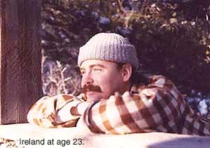
Largely self taught, Ireland's career officially began in 1974 with his first one-man show at the Burke Gal'ry in Las Vegas, Nevada, when he was 21. When he first began painting professionally, he had experimented some in oils, using a technique of a thin, drippy, application of paint, and loose or fragmented imagery. His interest, however, soon turned to the discipline of unforgiving watercolor, in which he worked for the next 20 years. His early watercolors were highly stylized, and his palette was almost exclusively sepia and Payne's gray. Stories from the Past: Western Art
One the chief influences on Ireland's
watercolors in his twenties, was the American painter Andrew Wyeth. He
admired Wyeth for his composition, clean technique, attention to detail,
and ability to evoke a whole story from a single subject. Ireland's work
reflected this interest in a budding fascination with the historical West
and its artifacts. In the beginning, these subjects were isolated
and
stripped of all context, forcing the viewer to notice such details as rust
patterns on milk cans, the weathered wood of old windows and wagon wheels,
the graceful lines of antique farm equipment, or the pathos of abandoned Around 1977, Ireland became absorbed in how the
elements formed or interacted with the land and the structures on it. Of
particular interest was the way water cut through the layers of sandstone
to form deep canyons, the negative space naturally created in a vista by
heavy snowfall, or how wind scoured away all soft material to expose bony
fingers of rock that seemed to strain toward the sky. His palette for
this Those Who Work the Sea: Marine Watercolors
In 1978, Ireland's interest turned to
the sea, and it manifested in a body of marine work that also began in a
loose, interpretive style (e.g. Wave*). His technique, however,
tightened considerably as he gained control over his medium to culminate Moods: Watercolors and PrintsThe photo research trips to Oregon in 1978 and 1979, led to Ireland's relocating to Portland in 1982. The move coincided with a restlessness with, and a growing frustration over, the limitations of genre painting. Between 1982 and 1990, he broke out of genre painting entirely to articulate his own vision. His palette shifted into the greens, grays, and blues needed to capture the soft pastoral quality of Oregon's Willamette Valley. Its lushness and density was a marked contrast to the subtle qualities of the desert. It wasn't long before his attention turned to the two great rivers in the area (the Willamette and the Columbia) and the nearby Oregon Coast. When that happened, his subject shifted from the extroverted impact of suggested story, to the subjective experiences of atmosphere and mood created by the constantly shifting weather and light. Watercolor remained the main media of choice in this period, but he found that the subtle effects of the aquatint and lift-ground printmaking also allowed him to capture these softer qualities in his vision. Sometimes interpretive, sometimes representational, water became a constant theme in every medium in which Ireland worked. "Water. More than just a necessary ingredient for the life of the body, it is also necessary for the life of the spirit," wrote Ireland on one occasion. "Often a symbol for the soul itself, it's sound, movement, feel, and cycle touch us every day of our lives." His themes included the way water caught light, the interaction of the elements, or the boundary line where water meets land. Ireland had great love for the works of the British painters Constable and Turner, and their influences can be seen in his work at this time in his emphasis on feeling and emotional tone. Nocturnes: Watercolors, Monotypes, and PastelsGradually Ireland's attention turned to the austere beauty of a river city at work. Here again, the boundary between water and land was a constant theme, only this time it was where the activities of man intersected with water and he painted bridges, ferry boat landings, and docks. He soon discovered a new element to explore: the quality of light at night. This became what was to be one of the central themes in Ireland's catalog, crossing every medium. He felt that without the sounds and light of day, objects and places revealed their true essence to a viewer open to their unhindered eloquence. The effect of moonlight or city lights on water or terrain, and flickering half-glimpses of the familiar -- cross walks, storm drains, cobblestones, and even fire hydrants -- were common in dozens of pieces.
In this period, Ireland began to
experiment with handmade papers from all over the world, and with adding
metallic pigments to add depth and texture to his prints and watercolors.
He also entered a new medium in this period, turning to monotypes, a
process whereby one applies paint to Plexiglas or metal, and then runs it
through a press creating a single edition print. Monotypes allowed him to Although Ireland liked the luxuriant depth of color found in pastels he only produced a half dozen of them. With one exception, these, too, were nocturnal scenes wherein he used the special qualities of this medium to capture a particular drama. Ultimately he preferred a more archival medium and abandoned working with them. Sets and Scenes: Traditional Watercolors and Set Renderings/DesignIreland always enjoyed the intellectual demands of a traditional layered watercolor. In the early 90s, he produced three watercolors of Seattle's Pike's Market that demonstrate his technical mastery of the medium and show the culmination of his journey from the particular to the whole in that medium. He followed the traditional method of laying down wash after wash to build up the color and density. Each piece took over a month to paint.
It was one of these, Let's Meet Back Here in an Hour,that sparked the
interest of singer/songwriter/author Jimmy Buffett's lighting director, who hired Full Circle: Back to OilsWhen Ireland moved to Bellingham, Washington in the early 1990s, he found a landscape that spoke to him in a way no other did. He soon returned to working in oils again after a nearly 20 year hiatus, as that medium gave him the depth and latitude with which to preserve that dialogue. Initially still preoccupied with nighttime imagery, he flirted some with the 'drippy' technique of his youth (see oil Departure). Unsatisfied, he quickly took what he'd learned of light by painting its absence and moved into a startlingly dynamic palette. His work exploded with color. Here, he built on the work of the French and Middle-European Impressionists. Rather than a harsh exterior source of light, Ireland's subjects often appear to be lit from within as he sought to capture the spirit, or genius loci, of a place.
His technique in oils 
A passionate painter, Ireland's work was full of contrasts. He was as likely to be interested in the personal as the panoramic, the natural as the man-made, the intellectual as the realm of emotional response. His images ranged from the intimate view of surf at night as it curls into the sand, to a six-by-eight foot panoramic view of Chuckanut Bay in Bellingham. A perfectionist, he was as at home with the challenge of an architectural piece, or the disciplined demands of a layered watercolor and plate preparation, as he was with capturing the profusion of voluptuous color in an autumn landscape in the Northwest. But what unites it all is the sensitivity of his vision and his always delicate application. Ireland refused to limit himself to any one subject, medium, or treatment. He preferred instead to continually explore the world around him -- always in search of the right medium for the subject, a way to expand his knowledge and ability, and the most effective way to capture the beauty he saw everywhere. Beauty was, for Ireland, the reason for painting in the first place. *Actual titles of work unknown
Can You Help?For the purposes of preparing a complete catalog and history of Michael Ireland's work, if any guests to this site have any information regarding his work (such as whereabouts, title, history, current location, owner, price paid, etc.), please click here to contact their estate manager for information. Your help is greatly appreciated. |
©2000-2010 Robin & Michael Ireland estate. All rights reserved.
Website by: www.weiselcreative.com
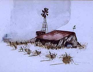 farmsteads, mines, and other structures -- each subject evoking the ghost of those who had used the item, or challenged the land and lost (see
Rusted Milk Cans or Barn). Soon, however, his focus began to expand, and so too did the context for his subjects. He traveled all around Nevada
and Utah, painting ruins, abandoned buildings, Indian ruins and artifacts, and barns. At first his backgrounds were vague and suggestive, but later became the subject themselves as he moved confidently into landscapes and integrated subject with context.
farmsteads, mines, and other structures -- each subject evoking the ghost of those who had used the item, or challenged the land and lost (see
Rusted Milk Cans or Barn). Soon, however, his focus began to expand, and so too did the context for his subjects. He traveled all around Nevada
and Utah, painting ruins, abandoned buildings, Indian ruins and artifacts, and barns. At first his backgrounds were vague and suggestive, but later became the subject themselves as he moved confidently into landscapes and integrated subject with context.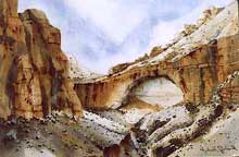 body of work still relied heavily on sepia and gray, but began to incorporate
the reds and oranges of the badlands, and the blues of desert
sky or standing water (see After Dusk -- both the print and the
watercolor, Canyon Walls (II), or The Great Arch). The
Grand Canyon was a theme he explored again and again in watercolor, then
later in printmaking (see Moonrise or Canyon at Dusk, Printmaking), as was the spare quality of the high desert.
body of work still relied heavily on sepia and gray, but began to incorporate
the reds and oranges of the badlands, and the blues of desert
sky or standing water (see After Dusk -- both the print and the
watercolor, Canyon Walls (II), or The Great Arch). The
Grand Canyon was a theme he explored again and again in watercolor, then
later in printmaking (see Moonrise or Canyon at Dusk, Printmaking), as was the spare quality of the high desert.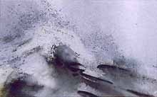 in a crisp, clean style. Inspiration for his marine portfolio came from trips to the Pacific Coast, specifically Astoria, Oregon,
Seattle, Washington, and La Jolla, California in both 1978 and 1979. What captured his attention
most were fishing boats, particularly those sitting idle, either in moorage or in dry dock.
His particular perspective often created a tension in the viewer presented with evidence of the
dynamic associated with labor (labor interrupted, anticipated, or longed for) and that of
separation from the source of one's being as represented by the sea.
in a crisp, clean style. Inspiration for his marine portfolio came from trips to the Pacific Coast, specifically Astoria, Oregon,
Seattle, Washington, and La Jolla, California in both 1978 and 1979. What captured his attention
most were fishing boats, particularly those sitting idle, either in moorage or in dry dock.
His particular perspective often created a tension in the viewer presented with evidence of the
dynamic associated with labor (labor interrupted, anticipated, or longed for) and that of
separation from the source of one's being as represented by the sea.  make a direct connection between image and mood. This fluidity married the
sensibilities of watercolor with the pigmentation of printing ink, while
at the same type incorporating the magic of chance. Typically, monotypes
are suggestive, rather than tightly controlled. Ireland, however, pushed
the boundaries with this limitation. The image Storm Warning is as detailed as a watercolor, but yet retains the power and punch of heavy
pigment, and the spontaneity so typical of monotype printing.
make a direct connection between image and mood. This fluidity married the
sensibilities of watercolor with the pigmentation of printing ink, while
at the same type incorporating the magic of chance. Typically, monotypes
are suggestive, rather than tightly controlled. Ireland, however, pushed
the boundaries with this limitation. The image Storm Warning is as detailed as a watercolor, but yet retains the power and punch of heavy
pigment, and the spontaneity so typical of monotype printing. 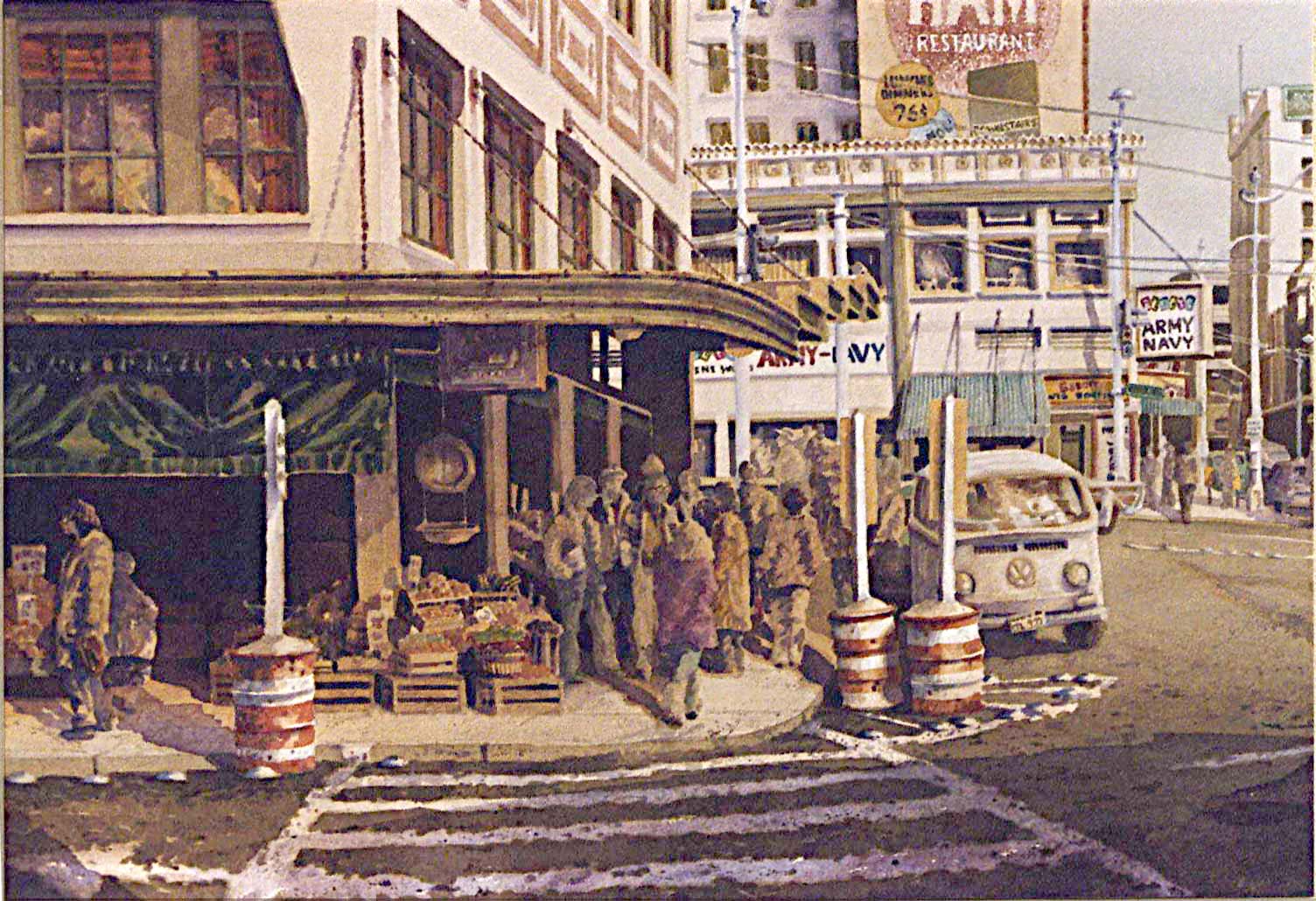 Ireland to do renderings of Buffett's set designs and kabukis. Ireland worked with
Buffett's LD from 1996 to the time he died, producing set designs and renderings for
five different tours. Though working outside his normal palette, this work still
demonstrates his feeling for line and his sensitive application of paint.
Ireland to do renderings of Buffett's set designs and kabukis. Ireland worked with
Buffett's LD from 1996 to the time he died, producing set designs and renderings for
five different tours. Though working outside his normal palette, this work still
demonstrates his feeling for line and his sensitive application of paint.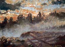 included starting with an underpainting, usually in contrasting colors. Continually reaching
for a way to add depth to a two-dimensional medium, he experimented some
with adding texture to his oils -- either through the heavy application of
gesso or by gluing cork down on wood or masonite before applying paint
(see oils Sooke Harbor Mist or In the Still of the
Night).
included starting with an underpainting, usually in contrasting colors. Continually reaching
for a way to add depth to a two-dimensional medium, he experimented some
with adding texture to his oils -- either through the heavy application of
gesso or by gluing cork down on wood or masonite before applying paint
(see oils Sooke Harbor Mist or In the Still of the
Night).